
![All About Junk Mail [infographic] Will it ever go away??](https://www.paulhelmick.com/wp-content/uploads/2010/11/media_httpdailyinfogr_kbFGh.png.scaled500.png)
Data & Infographics Articles
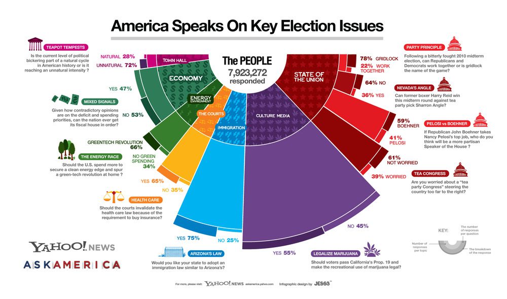
10 Questions, 8 Million Respondents, 1 Giant Election Infographic
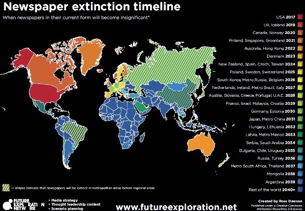
When will newspapers die out in your country? Check this infographic
Live Election 2010 Map by USA Today: Track House, Senate and Governor races: http://usat.ly/d863tc

Colossal Statistics of Identity Theft (Infographic)
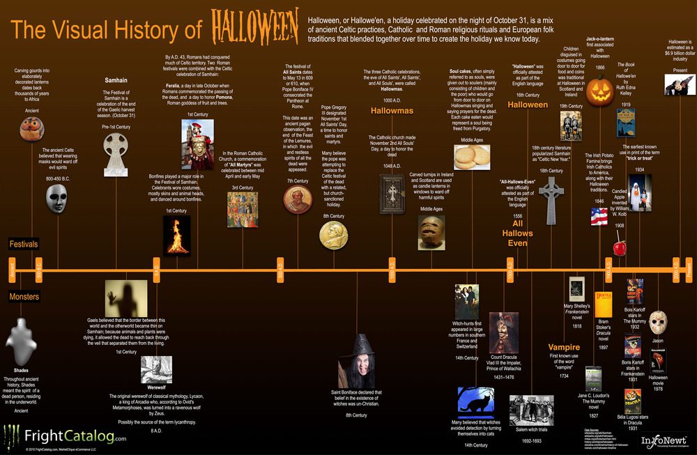
Infographic: The History of Halloween
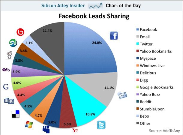
Chart: How People Share Content On The Web (Facebook, Email

How many hours do you spend doing this with technology? Gen X,Y vs Boomers

Chart: 75 Percent of American households own a computer – broken down by age, education

20 Highest Paying Jobs in America

In Pictures: America’s Highest-Paying White-Collar Jobs
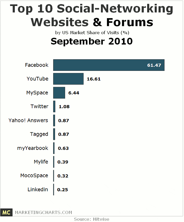
Chart: Top 10 Social Networking Websites – September 2010

The Fastest-Growing Cities In The U.S.

The Most Underrated Jobs in America (Infographic)

The World’s 100 Most Powerful Women
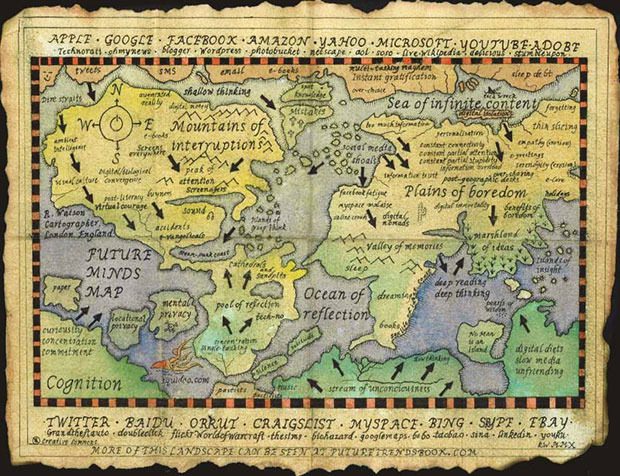
Mind Map of the Digital Age – Best viewed by people aged 35+ with full-time jobs and teenage kids.

Americans Are Horribly Misinformed About Who Has Money – See where it is…

Books of the Bible Very Cool Org Chart
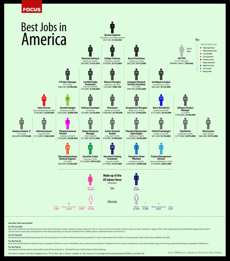
The Best Jobs In America (Infographic)

The Real Cost of Your Debt (Infographic)
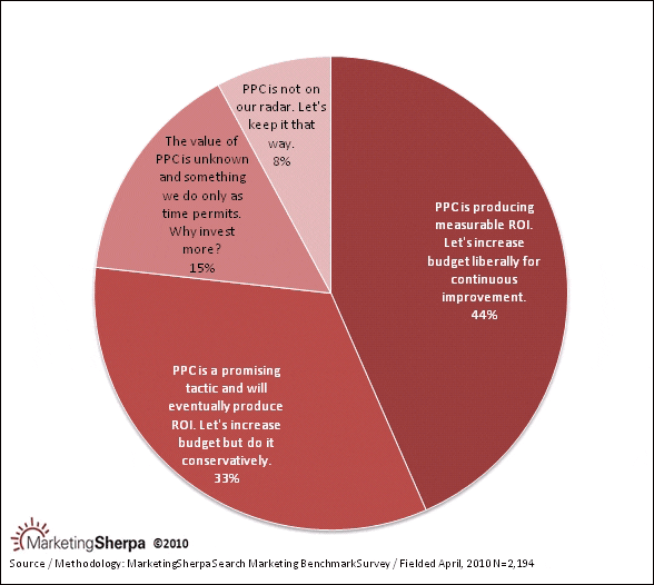
Chart: How Pay Per Click (PPC) advertising is perceived at budget time
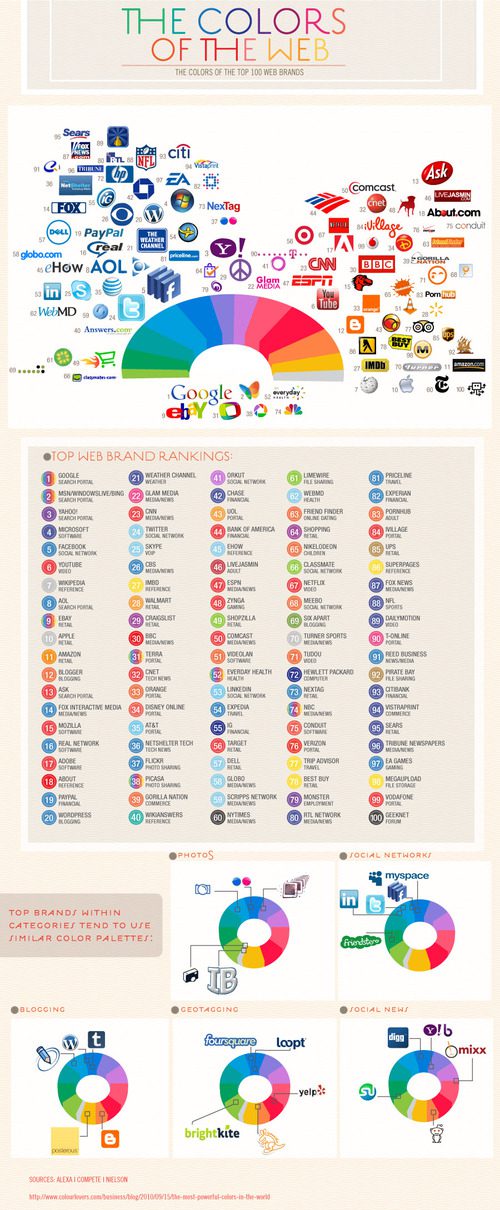
The Most Powerful Colors on the Web

“Halo: Reach” by the Numbers: Bungie releases launch stats