
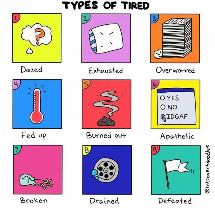
Tired is a word that can be used in so many different ways. You could be tired from lack of sleep, or you could be tired from working too hard. Which one do you most relate to?
Data & Infographics Articles

A compelling video – what we searched for on Google

A compelling video - what we searched for in 2017 It was amazing in the first 30 seconds of this video - the way the...
A Huge World Map on the Edge of a Lake. It Took One Man 25 Years to Build
It's pretty amazing what you can do when you have a little bit of time on your hands. Or a lot of time.... The...
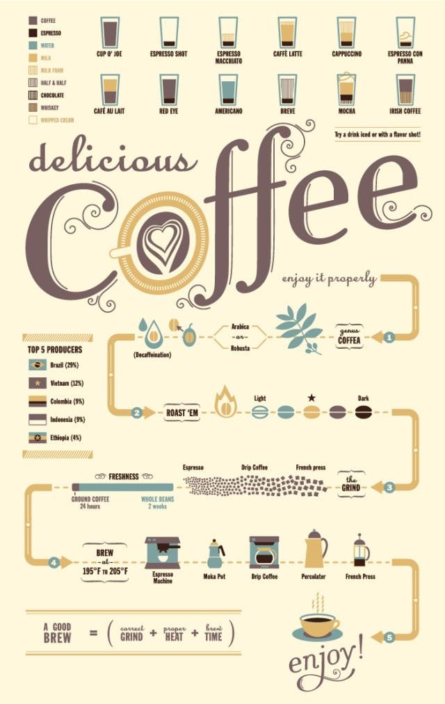
Coffee Flow Chart
How to enjoy the perfect cup of coffee! Via: Lifehack
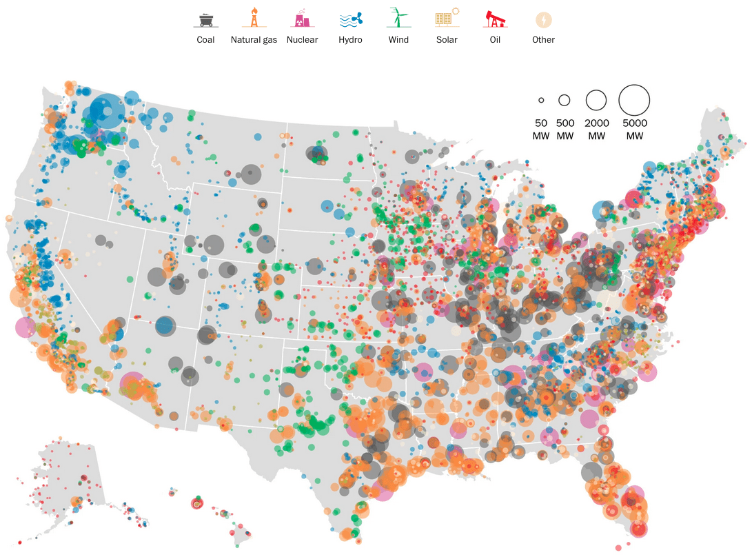
United States Electricity Map
This is pretty cool (or hot)... the Washington Post mapped power plants in the United States by type and capacity in...
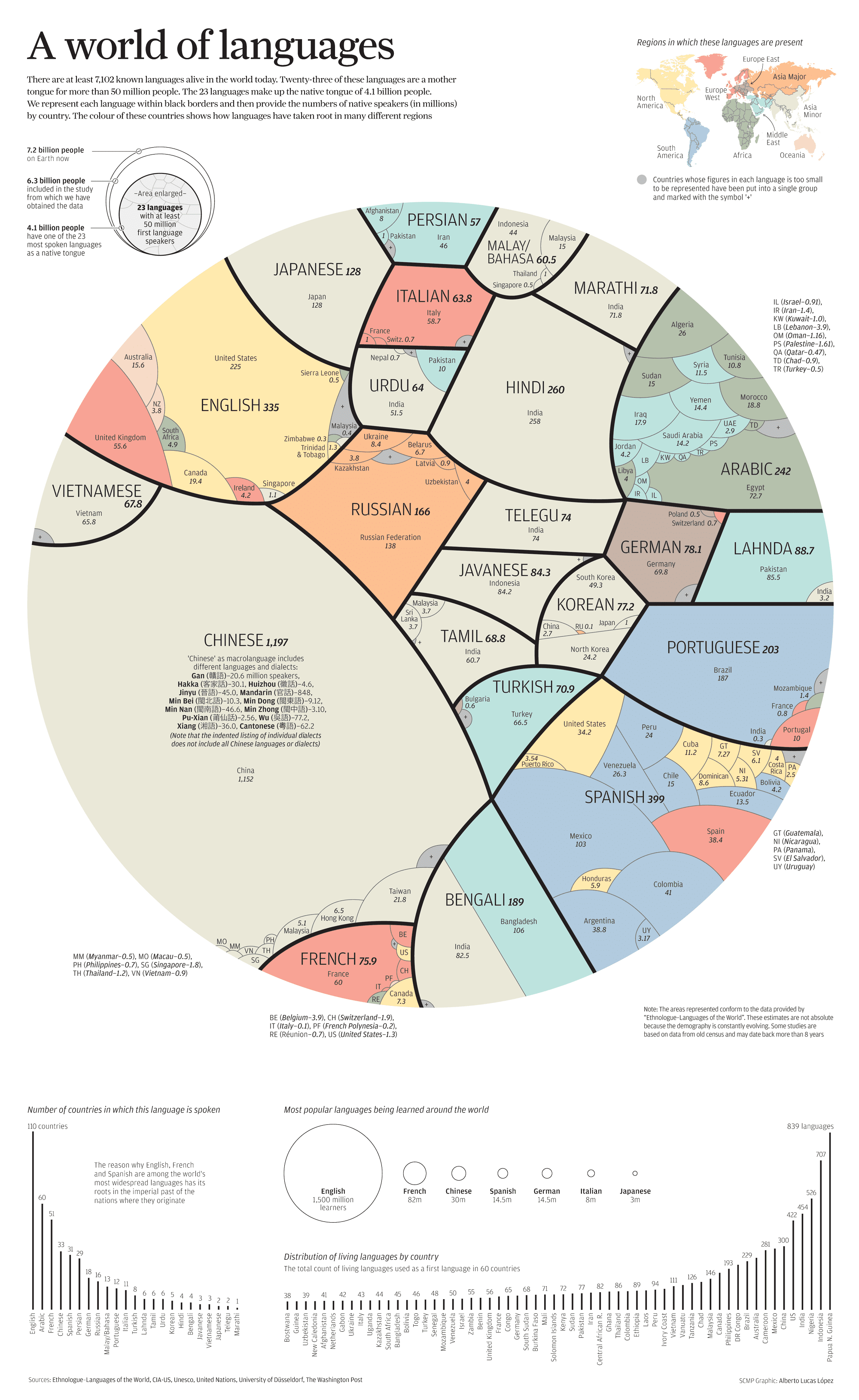
23 Languages Rule the World
There are 7102 known languages live in the world today. 23 of these languages are the native tongue of 4.1 billion...
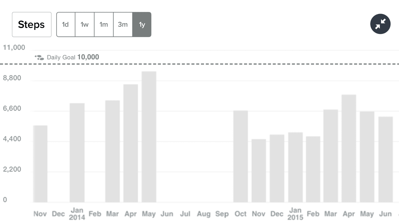
My historical Fitbit activity – daily steps and miles per day

Here are two charts from my Fitbit for the past year. It’s neat to see how these things trend over time.
Where WordPress fits in the website world
Marketshare of WordPress continues to increase and dominate the web. 22 of every 100 new, active domains in the US are...
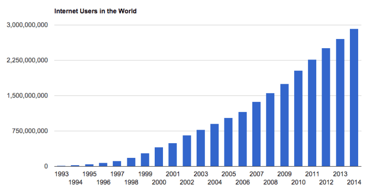
Realtime Internet Usage Statistics
Internet Live Stats provides realtime data updated on the screen every second on Internet users and 20 other internet...
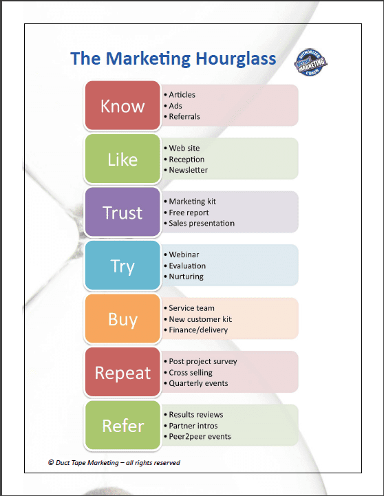
Chart: The Easiest Way To Explain the Marketing Process
The Marketing Hourglass – (click to enlarge) via ducttapemarketing.com Know – Your ads, article, and referred leads...
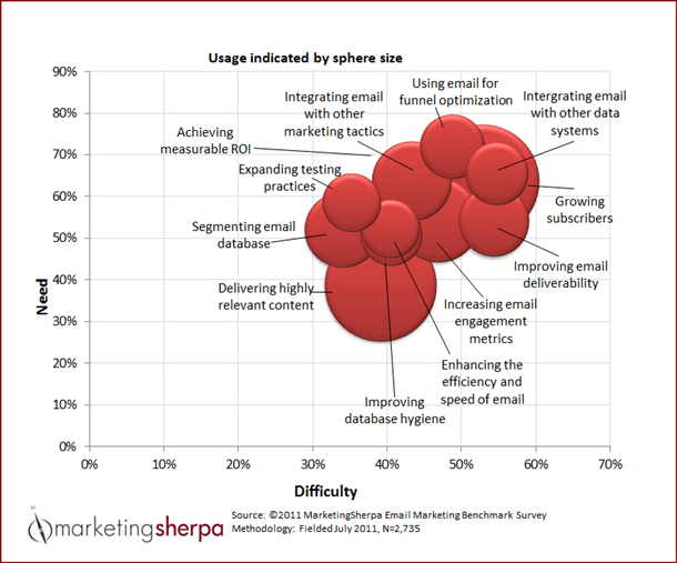
Chart: Top 12 email marketing objectives
Email is here to stay... and brands must learn to make the most of it. Limited marketing budgets often force...
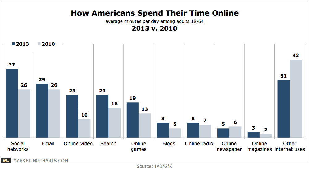
How American Adults Spend Their Time Online

Social networks account for the single largest share of consumers’ time online, then email, video and search. Via:...
WordPress Infographic
WordPress Statistics: Powers 72.4 Million websites 25% of all new websites built on WordPress Powers 14.7% of the top...
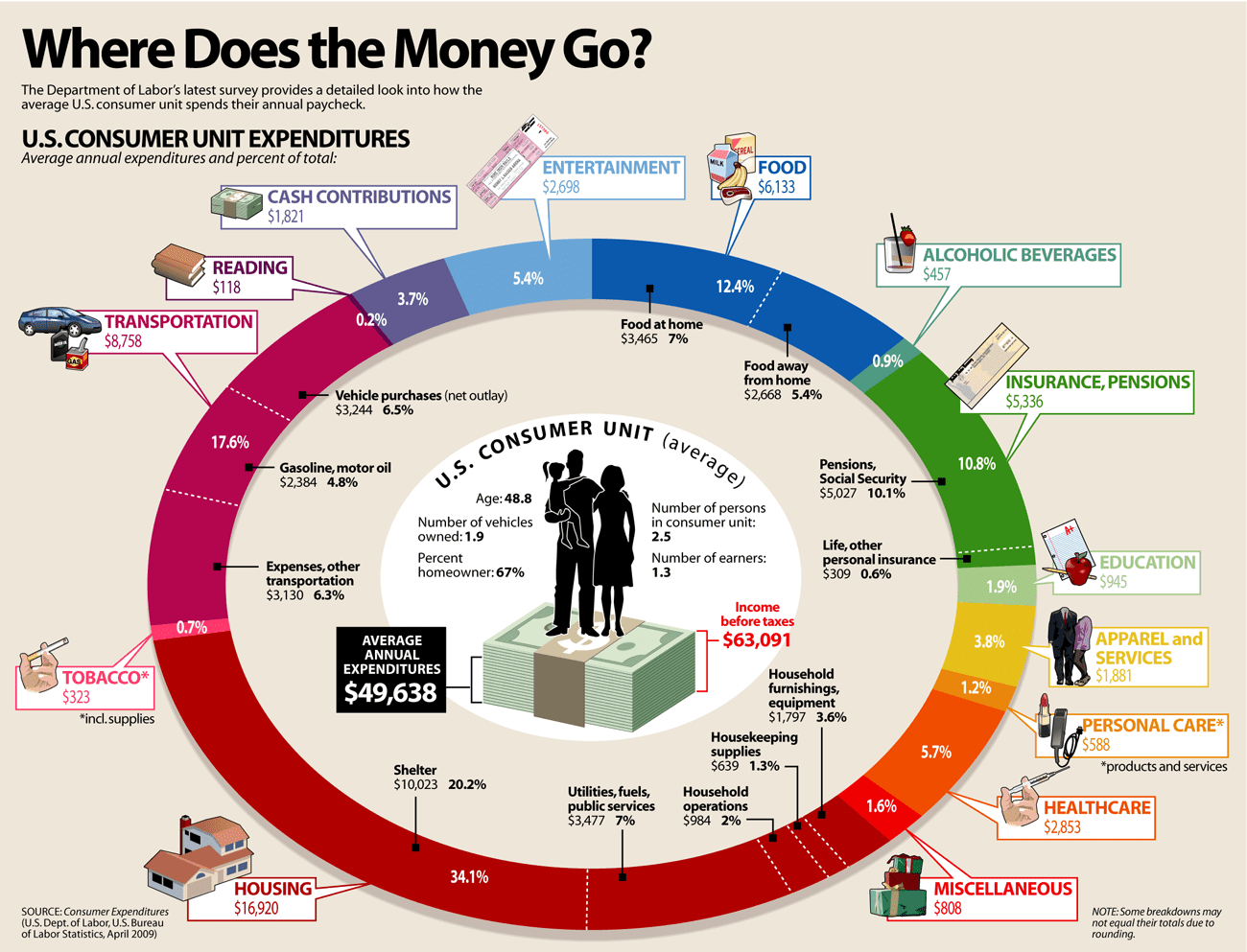
Where Does Our Money Go?
Money in. Money out. Awesome chart of where our money goes. Via: Daily Infographic
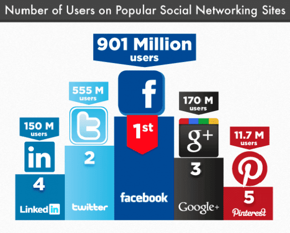
Table: Number of Users on each Social Media Site: April 2014
Facebook: 1.23 billion monthly active users via Facebook YouTube over 1 billion monthly unique users via YouTube...
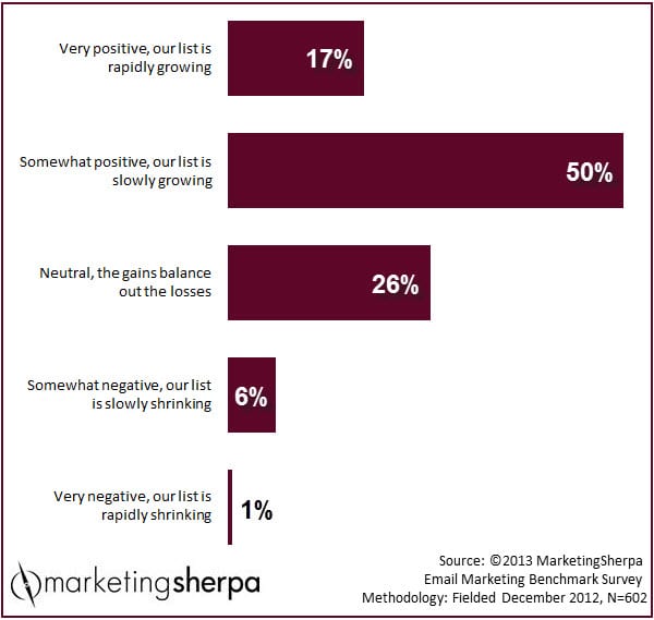
Marketing Research Chart: Are email lists growing or shrinking?
Is your email list growing or shrinking? This is the year for building your email list. The value to a list is more...
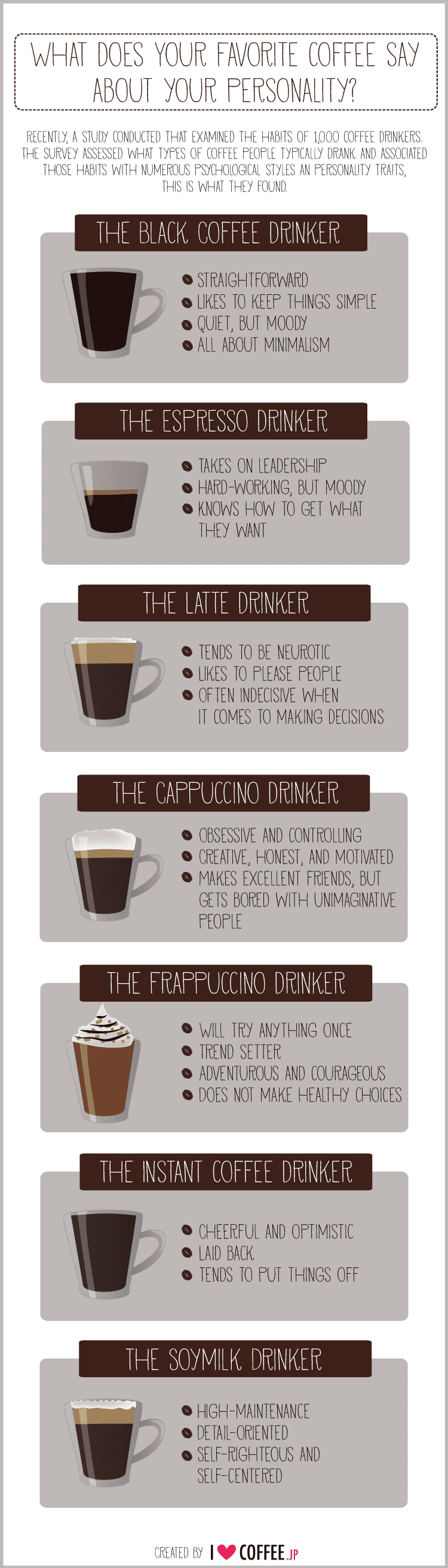
What Does Your Coffee Say About Your Personality?
Here are the results of a a survey that examined the habits of 1,000 coffee drinkers to profile their psychological...
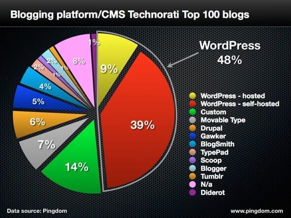
WordPress Dominates The World’s Top 100 Blogs
WordPress now completely dominates the top 100, accounting for almost half 48% of the blogs.
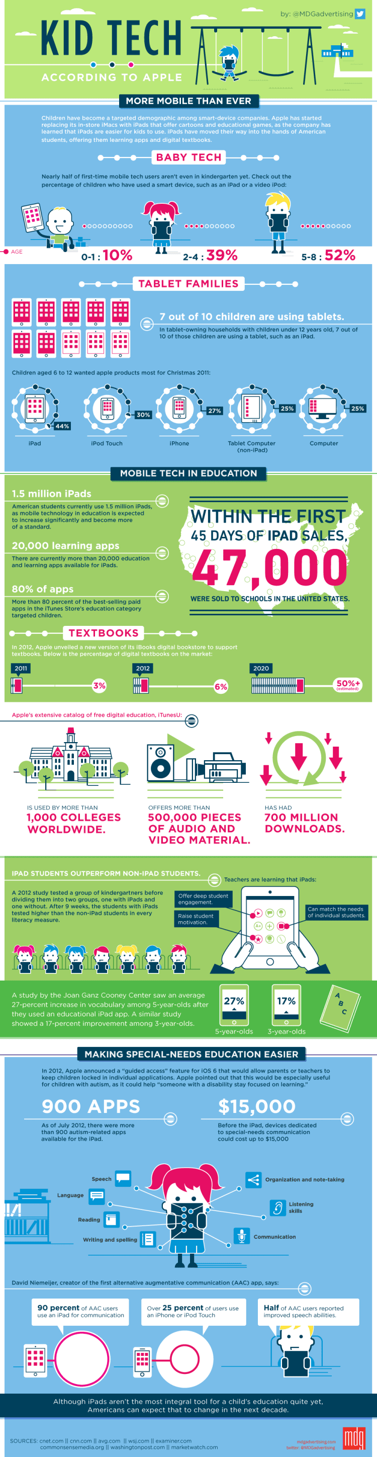
iPads and Kids Infographic
Interesting facts: 7 out of 10 children are using tablets. That’s UNDER 12 years old. There are over 20,000 learning...
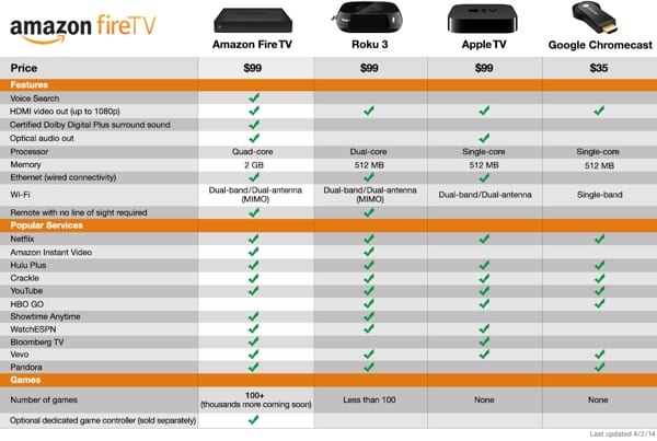
Comparison Chart Amazon Fire TV vs Apple TV vs Roku vs Chromecast
Absolutely amazing innovation from Amazon that beats out all the other alternatives.
LinkedIn Sequences the DNA of Startup Founders [Infographic]
LinkedIn released an infographic studying entrepreneurs and how they came to their position if life. It's interesting...
10 Email Best-Practices [Infographic]
Nearly 123 billion emails are sent every hour, so marketers must master the art of getting their email seen in a...
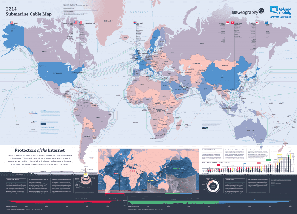
Map of the Internet
The map charts out all the undersea fiber optic cables that are the true backbone of our global infrastructure and...
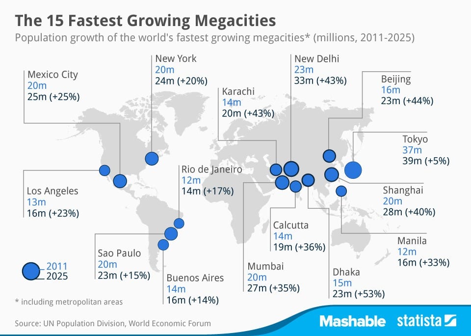
The 15 Fastest-Growing Megacities
Did you know there are more than 25 "megacities" — that is, cities and their surrounding metropolitan areas with total...


![LinkedIn Sequences the DNA of Startup Founders [Infographic]](https://www.paulhelmick.com/wp-content/uploads/2014/03/LinkedIn_Startup_DNA.jpg)
![10 Email Best-Practices [Infographic]](https://www.paulhelmick.com/wp-content/uploads/2014/04/ten-best-email-practices-infographic.jpg)